Design Systems
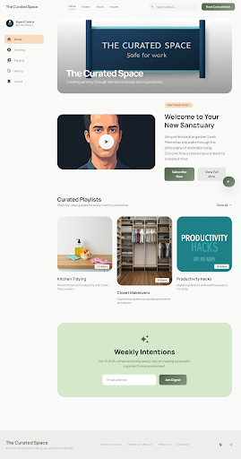
Curating the Digital Canvas: Channel Home
April 17, 2026
How the Manrope and Plus Jakarta Sans typefaces combine to create an authoritative yet humanistic digital environment.
Typography: The Editorial Voice
We utilize two distinct sans-serifs to balance authority with approachability. This approach ensures the content feels invited and easy to digest, mirroring the physical sensation of a well-organized closet.
Display & Headlines (Manrope): Our "Architectural" face. High-end editorial feel, like a premium interior design magazine.
Body & UI (Plus Jakarta Sans): Our "Humanist" face. Highly legible and friendly.
Always maintain a significant scale contrast. Avoiding middle-ground sizes prevents the "generic" look common in modern web design.